The moment you've all been waiting for: what results would a designer not familar with steampunk come up with when given the mission of redecorating a bedroom in a steampunk syle? (This blog is almost as good as reality TV, isn't it? OK, perhaps not.)
If you'll remember, a couple weeks back I posted about a company, Design By Photo, that I was engaging to propose a steampunk design for my bedroom. The results are above.
Here's what Lynn Cimino, the designer of of Design by Photo has to say about it:
Please find your room makeover attached. I want to thank you for introducing me to steampunk, I love it! That's not to say I think I have the style absolutely defined here but...
Looking at the steampunk thing from a designers angle it makes a lot of sense. A basic design theory is called opposition, where elements of the room work together due to their differences rather than their sameness. I think that is the appeal of steampunk. The strong contrast between Victorian refinement and industrial grit, old technology vs new etc. makes it very interesting. It's also a green concept as we need to stop buying so much new and find ways to salvage and reuse.
The challenge of this design style is not to make it look like a theme restaurant. For this reason, and because its a bedroom, I kept the "staging" to a minimal and I brought the cold industrial elements on the walls to contrast the simple but elegant, linen bedding. I've wrapped the main wall in a custom, sepia toned mural (actually free, well almost free at :http://www.makeuseof.com/tag/howto-free-and-huge-custom-poster-for-your-wall/ ) and used copper ceiling tiles on the two walls which share the closet and bath. The challenge will be finding the right image. The wall opposite the bed should be more quiet, perhaps a warm metallic paint from Ralph Lauren. Rich, heavier fabric could be used on the window wall in the window treatments. I thought your existing dressers, tables played into the style fine. I've added some copper pipe pulls to the dressers. Two pharmacy lamps in a nickel finish would be nicer to read by and seem to pop out from the wreckage of the mural. I've given a second life to half of an old suitcase as a tray table. A fitted, tufted cushion could also make this a useful prop for reading or for a laptop. An old belt brings in some of the old west and dresser up a throw pillow.
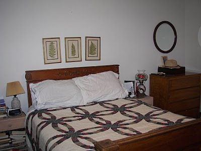
To be fair to Lynn, I also want to include my "before" photo -- in all it's cluttered glory, so you can see what she had to work around and why some parts of the "after" look the way it does.

One of the things that pleased me is that she used a lot of elements I have been thinking about for this room. The pharmacy lamp sconces. The tin ceiling tiles (I was thinking for the ceiling though -- using them on a wall is an interesting idea!). The metallic paint. The heavy curtains (I'm thinking velvet or damask). Part of what I needed from a design was validation of some of my ideas, and I did get that. I also like how she reused much of the existing furniture -- the bed was a requirement, but I didn't realize that dresser would work so well, and I'm thrilled that she kept my round mirrors over the dressers.
The brillant idea here, though, is the mural. I would never have thought of that. I'm not quite sure I'm brave enough to implement it, but I really like the idea. If you could find a nice closeup of some steam engine parts... cog wheels... pipes... wouldn't that work well? I'd perhaps go for a more brass toned mural than the sepia, but it's definitely a way to bring "steampunk" into the room. Gentle readers, do you have any ideas for pictures I could use to do this?
Overall, the metallic shades she used were a bit more copper based (perhaps because of my recent posts on using copper pipe) than brass based, and we all know what the steampunk preference is. So I'm thinking brass more than copper for the ceiling tiles and drawer pulls.
What you don't see in this view (and Lynn only does 1 view per project) is my windows and the opposite side of the room. I think I'd go with a deep red velvet/damask valance over my very long window with my chaise lounge uphostered in the same fabric. I like the the idea of simple bedcoverings for summer -- I have a white cotton duvet cover I could use -- but prefer something in a heavier fabric (the same deep red?) for winter.
update 6/28/2007: I'm collecting potential pictures for the mural on this kaboodle list. If you know of any other good ones, send me a link!


